Theme Park Checkout
UX RESEARCH AND DESIGNA global parks and resorts organization wanted to reassess their digital platform and revamp the ticketing experience to better fit consumer needs, particularly for their location. Independently running in parallel to this project, a sister location was underway with a massive overhaul to their Global Design System (GDS) with the goal of unifying the visual and experience of all parks and resorts worldwide.
The task for this project was to conduct user research for the Western North American market, design the best-in-class user experience with the GDS in mind, and contribute back to the system with the findings.
We conducted preliminary research with end users prior to going into design and then again, post-design to validated our assumptions. All the while, doing technical validations and infusing into their East Coast design team.
CLIENTA Global Parks and Resorts Organization
DURATION6.5 months
ROLEUX Researcher & UX Designer
Wireframes and research documentation are available upon request.Phase 1 Research
―
10 unmoderated remote usability study on the current state of the ticketing experience.
10 unmoderated remote usability study on a competitor’s website of their ticketing experience.
20 moderated remote user interviews to uncover consumer behaviors when planning and executing a theme park trip. Gather participant feedback on portions of the site unrelated to the ticket purchasing experience. Get in-depth feedback on the ticketing process. Understand user sentiment on different pricing structures.
Provide recommendations and strategy based on findings from the first three rounds.
TOP THREEFindings from Series 01 – 03
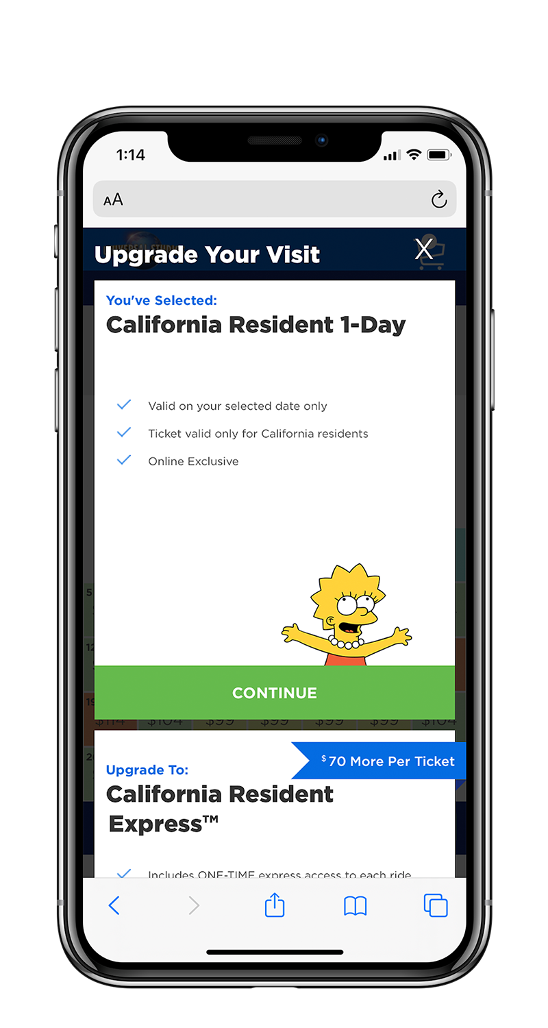
Lack of Personalization
None of the guests during our two rounds of user testing and interviews engaged with the up-sell modal which caught our attention. The only option was steep price jump without any expressed value of the offering. Users were looking for lower-level commitment type items, such as parking passes, food, and beverage options.
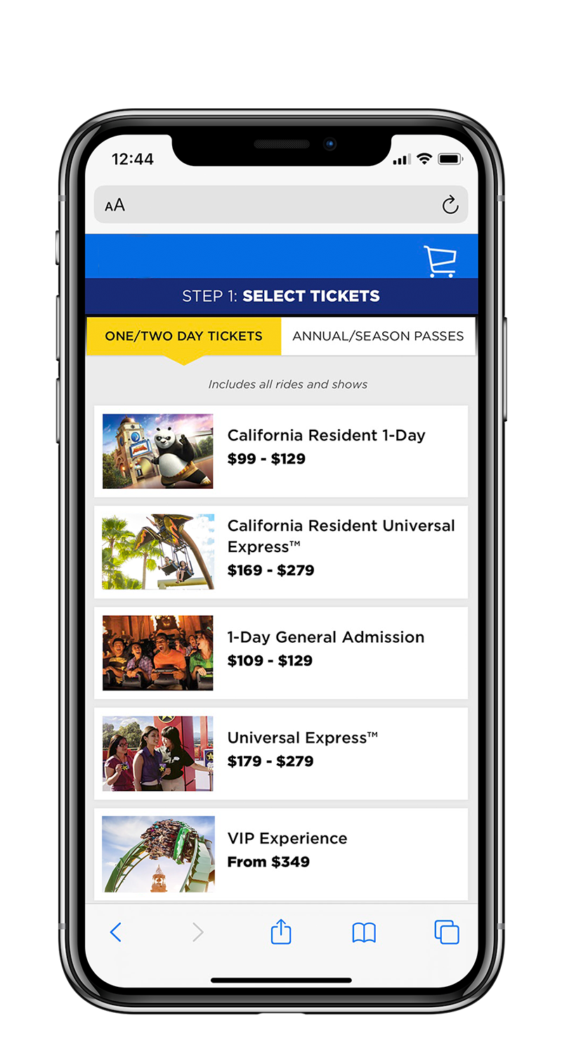
Lack of Information Sense
After users made a selection on the homepage dropdown, guests were then brought to a ticket list page, where users had to select their tickets again, but this time, was shown more ticket options than the previous step. In addition, the ticket list page provided no description of the ticket types.
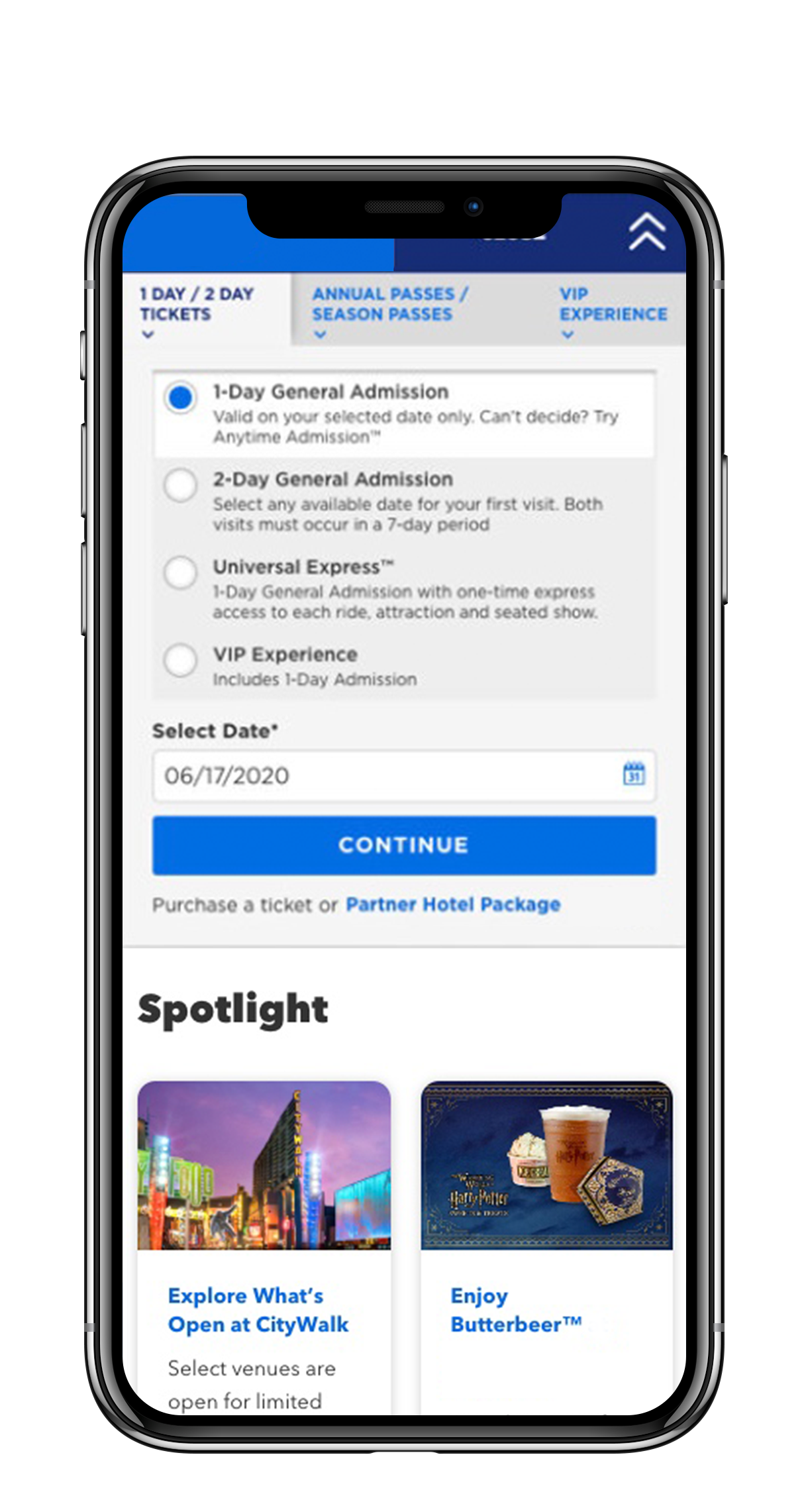
Difficult Ticket Comprehension
Users were unable to see all ticket types within their first encounter via the homepage dropdown shown. With inadequate product descriptions users felt forced to opt-in for a choice they did not feel 100% confident in.
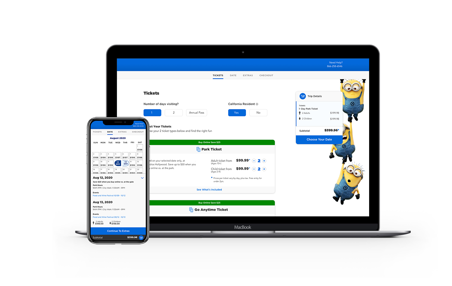
Trip Planning Reimagined
Progressive Disclosure
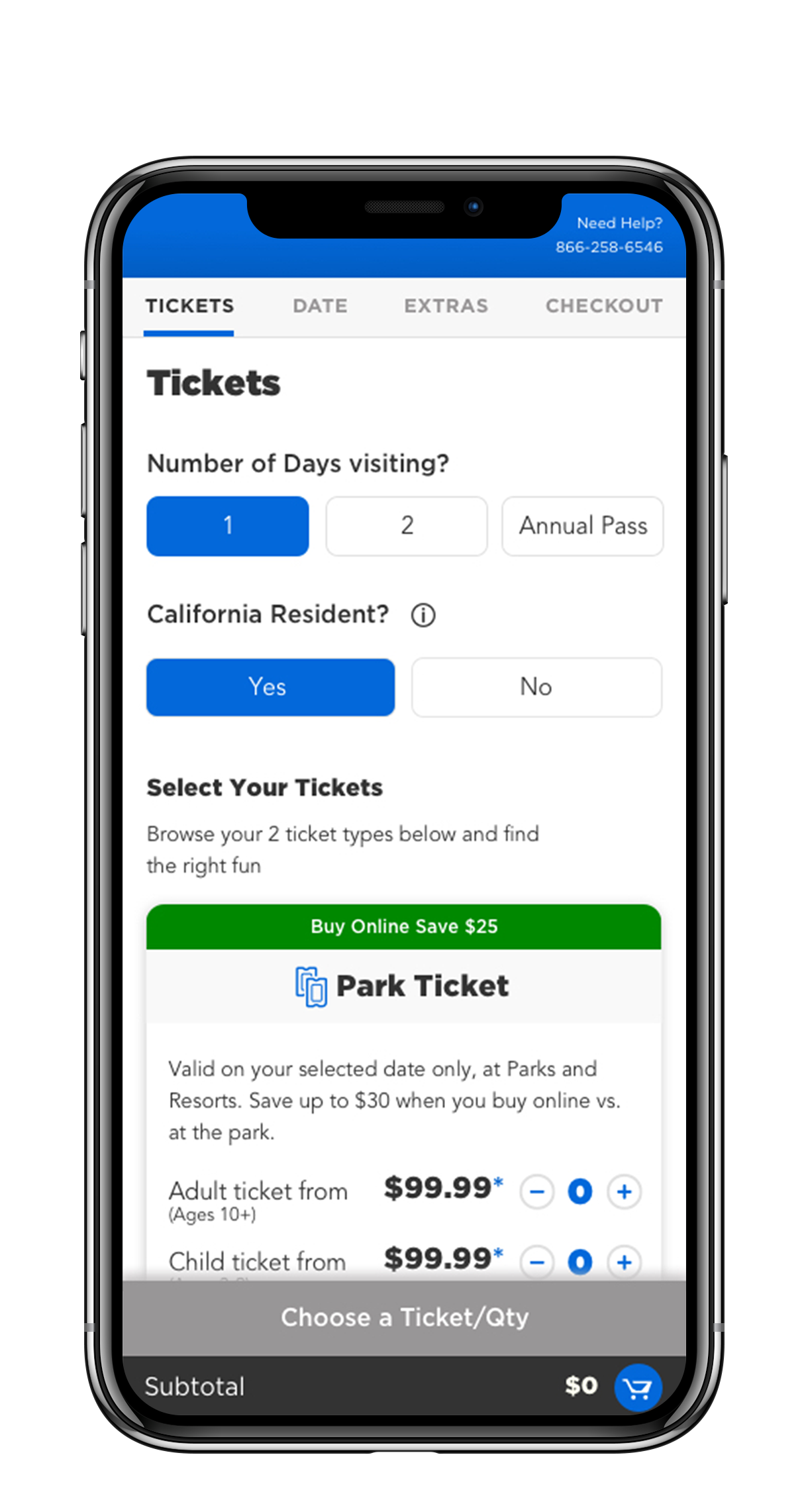
User selected the number of days they were visiting and resident options to filter down the relevant ticketing options.
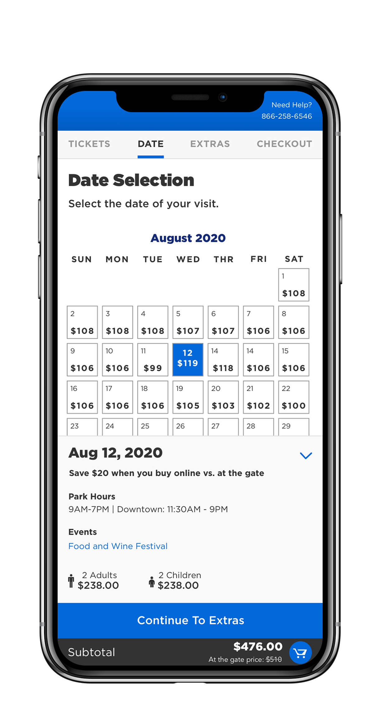
Digestible Information Sense
The new ticket cards provided clear distinctive information that allowed users to easily understand what the differences of each ticket where, in addition to perceived value.
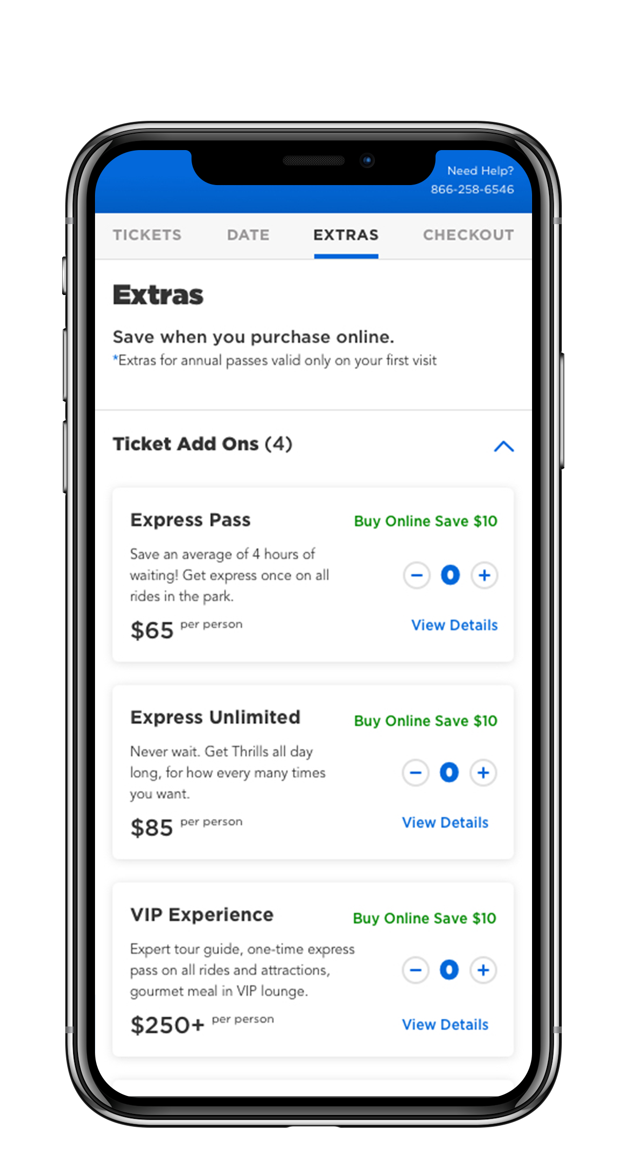
Strategic Upsells + Increased AOV
Based on a user’s ticket selections, the new solution would display relevant, dynamic upsells.
Validation User Research
―
10 unmoderated remote tests for a low-fidelity prototype of the new ticket purchasing experience before going into high-fidelity designs and recommend optimizations for high-fidelity comps.
5 unmoderated remote testing of the new high-fidelity ticketing experience. Gather participant feedback on various portions of the flow. Recommend optimizations for next phase of the project and contribute to the evolving Global Design System with the East Coast team.
User Feedback From Phase 2
“It tells me that it pays to get it done early. Helps me plan out my day even further.”
— Monica T., on the new ticket list page
“Very valuable to get all that extra information to help me make an informed decision based on demand, cost, days of the week, how much, and what special features are available that day.”
— David O., on the new calendar design
“I’d probably buy all of this.”
— Elliot V., on the new upsell redesign
Project Outcomes
The stakeholders were thrilled with the project outcomes. The designs were handed off to the East Coast design team. Unfortunately due to COVID, parks were shut down and the project is now pending.
Because the checkout experience is a highly sensitive and critical point of the website experience, what I would recommend as next steps is to implement the new checkout experience in development, and work with the Consumer Insights Team to conduct a virtual focus group with actual consumers. This methodology would allow researchers to do direct 1 on 1 observation, as there are many differences between what people say and actually do. Finally, strongly suggest a small scale roll out of the new experience.