Lovepop
CARD PERSONALIZATIONLovepop cards is a greeting card company that creates magical moments through their 3D pop-up sculptures. Lovepop operates both online and in retail across the nation bringing in a multi-million dollar revenue stream. With 26,815 transactions per week, the website was overdue for a redesign of their card personalization flow.
In 6 months, my team was able to pave the way for iterative & data driven design by tackling major design problems and embracing business revenue goals for the mobile shopping experience. We accomplished the following:
INCREASED
PERSONALIZATION ADOPTION
+17.4%
MAINTAIN
REVENUE PER SESSION
+$0.03
DURATION6 months
TEAMCollaborated with 1 project manager, 2 tech leads, 1 UI designer, 1 Interaction designer and the full client-side product team.
ROLEUX Researcher, UX Designer
Discovery Phase
―
Through usability studies, uncover the problems people face and determine which are most important to solve. Find opportunities for how we can make our experiences better for people. Understand the business context for how the site is performing at that time, and examine how the redesign could impact the overall performance of the site.
USER NEEDSPeople didn’t understand the card form factor and where their message would go on the card. People often times confused the send and return address and mailing it out to the wrong location. Lastly people encountered various usability hiccups in the interface.
BUSINESS NEEDSTo increase the usage of the personalization service, position the service in a light that provides value to the user vs an upsell. To maintain, or improve the conversion rate of the site with the redesign.
Design Exploration
―
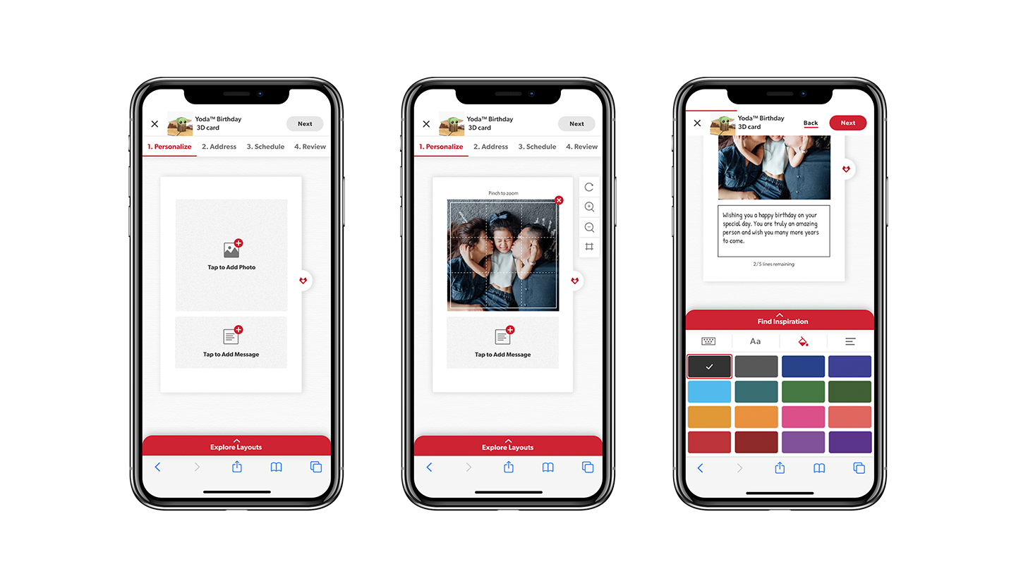
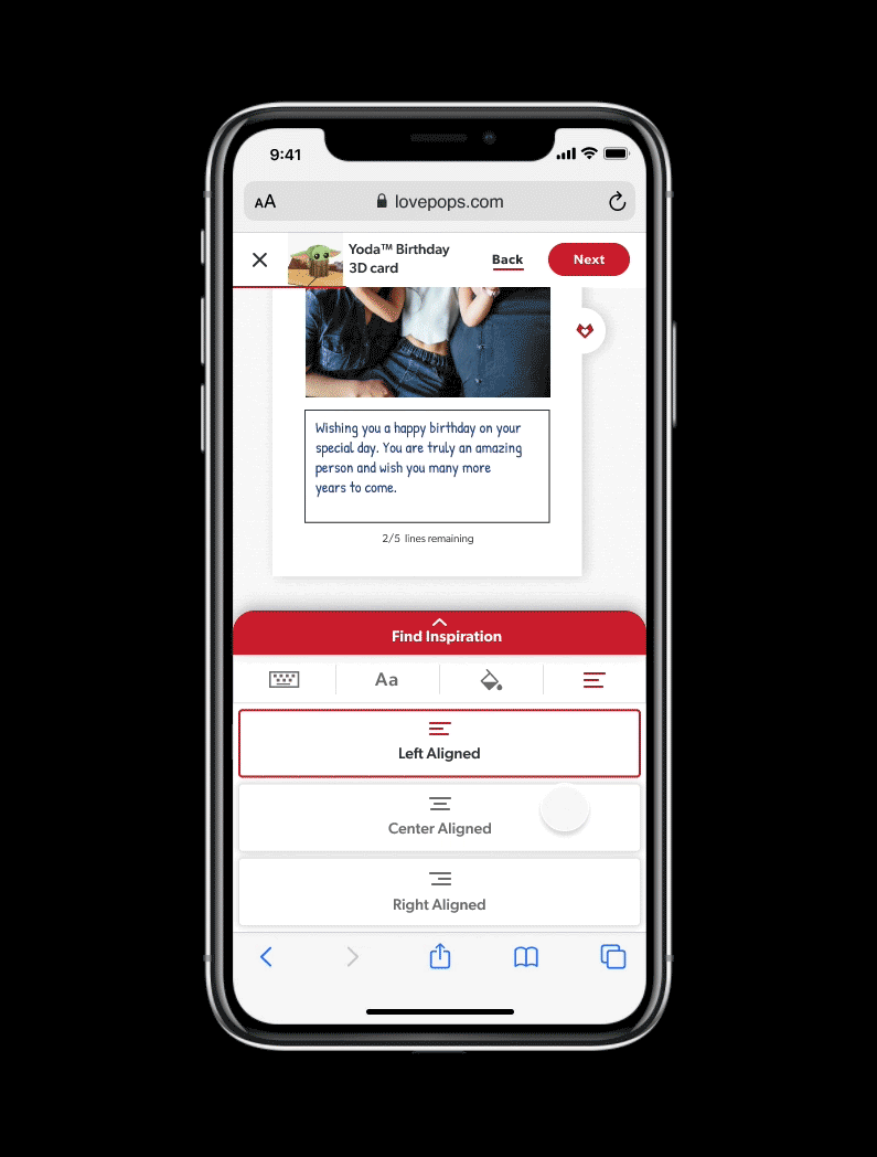
Based on our research findings, we decided to add a visual animation of the card opening with the insert sliding out of the right pocket to bridge the disconnect of where the customer’s message would go.
The challenge was that Lovepop offered personalization for different format of cards, and the ultimate solution had to be flexible and scalable to support new formats moving forward.
To make the address entry clear, we iterated on several versions of how a user would easily enter in the right address at the right time. Ultimately, we voted the ideas and decided to choose the option with the skeuomorphic envelope as this was a visual connect to something people were very familiar with.
Additionally, we also wanted to provide more value and introduced an address retrieval assistant feature, where a user could provide the recipient’s email, and Lovepop would email the recipient on behalf of the sender.
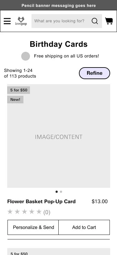
In order to increase the adoption rate of the personalization service, we examined how it was being presented and communicated to visitors. The challenge was that Lovepop had a large percentage of people who added products to their cart from a product list page and we certainly had to maintain that path. Ultimately we decided to introduce a dual CTA on the product list pages that would allow users to still quickly add to cart, but also surfacing the personalization service higher in the customer journey.
Deliver and Measure
―
With client and team agreement to move forward, we worked with UI and interaction designers to bring the designs to life.
Naturally, slight modifications happened post wireframes to smoothen out the experience, like adding in a structured address entry form after tapping on the placeholder on the envelope. This would help users enter the data in a formatted structure with masked field entries to lessen and prevent errors.
In addition, we launched an A/B test for the dual CTA’s on the product list page to track performance before confidently releasing it at full scale.
Learnings
―
Due to the sensitive balance of encouraging personalization yet maintaining conversion rate, designing iteratively and validating those choices before releasing it was critical to our success on the project.
Collaboration is table stakes. Without UI design and interaction design, the redesign of the personalization flow would not have been as lively and engaging to users. In addition, understanding the business goals of the project allowed us to frame the problem space more effectively.
““This is kind of fun … a gift in itself…”
— Valerie D., 55 Years Old
USER TESTING FEEDBACK