BeautyCounter
USER RESEARCHA beauty monolith in the American direct to consumer sector, BeautyCounter sells skin care and cosmetic products to beauty enthusiasts across the nation. Historically, the majority of revenue was generated by the 40,000+ beauty consultant network. The digital team saw staggering conversion rates on the DTC eCommerce site and dealt with the ongoing internal conflict of the consultant side of the business.
BeautyCounter looked to conduct user research to better understand the shift in consumer behavior, where brands are moving to complete direct-to-consumer models, and overall, a deeper understanding of the users’ goals, and motivations.
In one month, we delivered a competitive and heuristics analysis, conducted moderated interviews with end users, and provided actionable takeaways for the digital team.
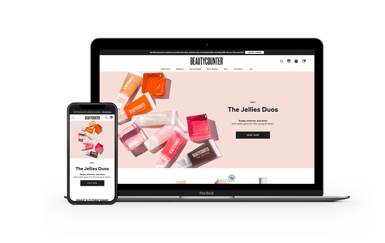
SITEbeautycounter.com
DURATION1.5 months
ROLEUX Researcher
All supporting documentation in this research study can be provided upon request.Competitive Analysis
―
STRENGTHSStrong brand mission towards clean beauty and environment issues
High-quality and effective products
Location/retail presence
WEAKNESSESHigh price point
Not effectively communicating product benefits and proven results
Lacks photography strategy (product, on-model, before and afters)
Not effectively communicating membership perks and value
In the moment virtual support and easy ways to virtually reach out vs having to call
OPPORTUNITIESGenerate content and editorial pieces that supplement and help sell the products
Encourage upsells, product recommendations, complementary products and sampling to increase product in consumer’s hand
More inclusion of CounterMan
Lean into being community driven
Improve the strategy being communicating unique selling propositions
THREATSSaturated beauty market with similar missions
Content creators and tastemakers within the industry with more compelling stories
Negative public perspective of consultant side of business
Themes From The Heuristics Analysis
―
COGNITIVE OVERLOADBloated navigation with irrelevant links
Dense information on product detail pages
LACK OF SUPPORTPoorly translates product benefits to the consumer
Lack of contextual information such as what comes in a set, and what this product treats
Lacks proper education about clean ingredients used in formulas and certifications
Lack of before-and-after photos
POOR PRODUCT EXPLORATIONBeauty consumers commonly purchase regimens and sets to combat their concern but the product detail pages failed to display, “This goes with this product” or “Recommended for your concern”
Behavorial Findings From Qualitative User Research
―
Majority participants did not have a negative perception of consultant-based beauty companies while also being a current customer. Those that have made this type of purchase felt indifferent and noted the positive in-house ‘party’ experience.
Beauty and skincare consumers preferred to make their purchases online vs. in-store. Consumers shared that they generally prefer to make purchases online but the pandemic exasperated this preference as stores were closed and stay-at-home orders were in place. Those that preferred to shop online overall felt like there was more value and buying power vs going in-store.
Users typically spend time researching a brand through reviews online, before & after photos, and on social media. Shoppers felt that by reading reviews, they had a better and more authentic perception of the brand and quality of products.
Although consumers had a general idea of good and bad ingredients in skincare, they don’t strictly follow them. Only 2 of 5 participants leaned strongly towards clean ingredient products due to allergies and reactions had in the past. Others, shared that clean ingredients is a nice-to-have but is not a rule strictly followed because they want to see results.
Website + Usability Findings
―
Uninformative photography strategy
Users craved aspiration and connection with BeautyCounter through more model and lifestyle photography. Product comprehension was very challenging task for users because the site failed to provide consistent product photography showcasing packaging, scale, on-model, before & afters, consistency, and applicator.
Inconsistent content strategy
Consumers lacked engagement with the content and information presented on various pages. The behavior captured users passively scrolling through the pages, sparingly picking up keywords that caught their attention.
Lack of education
Users were unable to share what made BeautyCounter unique but rather highlighted the high price point. Those that generally read about The Clean Promise, wanted to be educated on the ingredients that were in BeautyCounter products and why it is better. The site failed to properly educate consumers thus hindering brand trust.
Optimize eCommerce patterns
Small-to-medium nuances that users encountered, summed up to be a sub-par website experience. These nuances included a bloated navigation, confusing product way-finding, a barricade to checkout (e.g., Shop with a Consultant), vague product titles, etc.
Supporting Quotes From Users
―
“...because if i'm looking for acne, it, may need to be a moisturizer and a serum. Or a cleanser and a toner. [The navigation dropdown] was harder for me to navigate to see exactly what I’m looking for.”
— Jesica F.
“…if there was a recommendation on this page that says this toner goes well with this moisturizer... then I might be inclined to purchase both, but I actually don’t see that anywhere on the page…”
— Jo S.
Project Outcomes
The research was presented to the VP of Digital and his team to assess next steps. In lieu of not having outcomes, I would have recommended the following next steps to measure our research.
Conduct a roadmap including all recommendations outlined in the findings report. Prioritize proposed enhancements based off an aggregated score from business impact, customer value, and implementation complexity. Identify those enhancements appropriate for an A/B testing plan, and those better served through qualitative means. Work with the UX and design team on visual solutions. Finally, run the experiment and collect data against conversion metrics, customer happiness metrics, funnel improvements, and overall usability.