Nuun Hydration
ECOMMERCE REDESIGNNuun Hydration is a health and lifestyle brand that offers drink products to optimize workouts and overall health. With an expanding product offering and a dated system, they needed help to revamp the site experience, and better way to connect with a growing audience.
Prior to the collaboration, Nuun had dispersed platforms to manage their backend system and conversion rate was plateauing at a steady lull. Nuun also needed a strategic UX partner to build a new Build a Box subscription experience, and find efficiencies in managing their ambassadors program.
We designed and built an entire eCommerce and social network experience in 6 months, with full enhancement of way-finding and product storytelling.
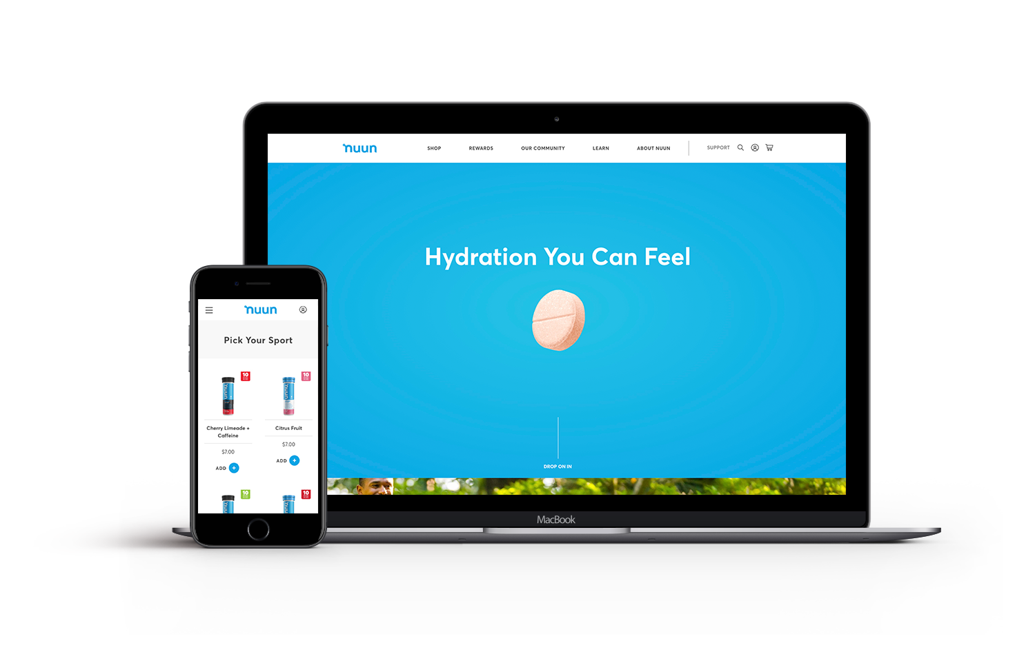
SITEnuunlife.com
DURATION6 months
ROLEUX/UI Designer
UX Phase
―
The users coming to shop the site were both new and nuun loyalists.
For new users, the UX had to consider the unfamiliar form factor of the tablet and how to use it. In addition, the website had to educate consumers about the nutritional and product benefits.
As for the nuun loyalists, we had to make the site easily accessible in terms of product way-finding and shopping. Secondarily, we built a full athlete ambassador and events social network that complemented the shopping experience. And lastly, nuun’s new eCommerce site had a quick and snappy build-a-box experience to serve those looking to subscribe and build a box of their favorite nuun products.
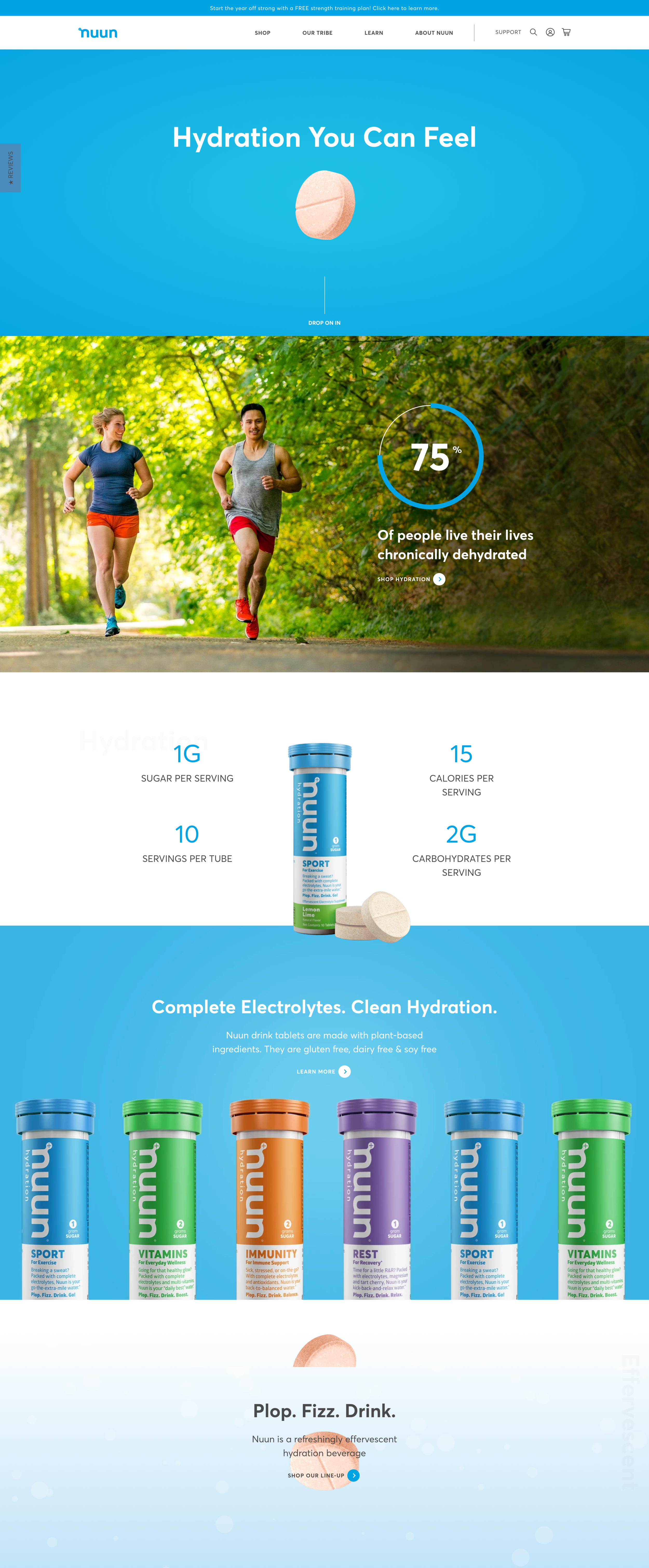
The Form Factor Homepage
In understanding consumer perceptions, the tablets had an element of mystery and complexity to them that could potentially make users hesitant to trying Nuun products. My primary focus for the homepage was to convey product form and usage immediately to de-mystify consumers.
Secondly, I leaned in on the product benefits of health and wellness. The site was launching in January, and knew that the message would resonate and align well with consumers looking to better themselves through healthy habits.
Lastly, my tertiary goal for the homepage was to communicate the product offering, and encourage exploration deeper into the site.
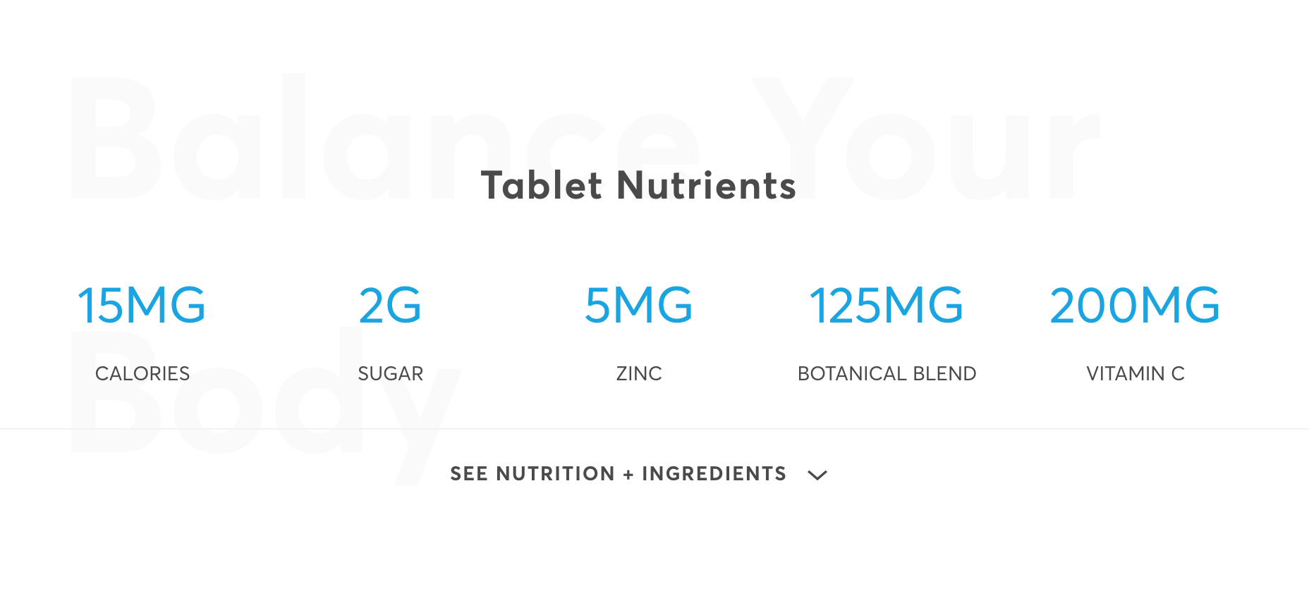
Think in Macros
We dealt with a very athletic community that was keen on tracking macros and nutritional intake. I designed a simple module that would provide high-level info that could be scanned quickly in the midst of product consideration. This also benefited new visitors who could understand the nutrient profiles immediately. For those seeking micro-information, it was neatly tucked behind the expandable menu.
Build a Nuun Box Flow
Shoppers were able to build boxes flawlessly, all the while having a running tally within the sticky bottom bar. The UI gave the user complete control to manage the subscription frequency, and visibility into what they ordered.
Results
The site launched back in November of 2018 and has seen much success since then. The Nuun team partnered with UserTesting.com to do an extensive usability and experience test with 8 participants post-launch.
View Website →
+213.5%
IN REVENUE (YoY)+77%
IMPROVED CONVERSION RATE+78%
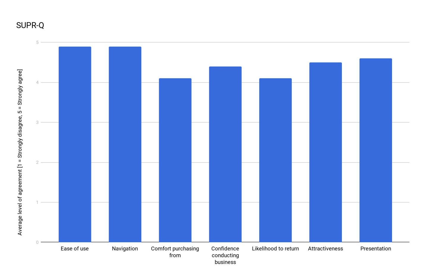
INCREASED ENGAGEMENTSUPR-Q Scores
Scores were high across all measures. Participants cited the ease of task completion, generally intuitive navigation, comfort and confidence in making a purchase, likelihood to return to the website, and the attractive presentation of the website as reasons for the high scores.
“[The] website is easy to use entirely due to the fantastic design of the page, which is intuitive, colorful, visual, simple, and, yet, elegant.”
— Female, 69 Years Old
USER TESTING FEEDBACK